

Background
Back in 2019, when our design team only consisted of one of the co-founders and one designer, the thought of having a design system didn’t cross our mind as we focused on understanding the basic question, “What kind of design would be delightful for our users?”
We tried different styles—applying patches and a Frankenstein-ish design approach as needed to meet the product-market fit quickly. This was also the time before the pandemic when everyone was working in the same room which made communication and collaboration simply a breeze.
What was the problem?
While fulfilling our vision of being the fairest and most customer-centric fintech company in Indonesia, we took the necessary steps of improving and diversifying Flip products. The product offerings expanded and so did our design team. We multi-tasked, meta-tasked, or whatever you’d like to call it.
Along with that, we noticed signs of change in the way we worked, for example:
- We used to give designers freedom about the UI design, except for colors, fonts, and button style that we'd agreed on previously; as long as it solved users' problems and was aesthetically pleasing. Unfortunately, when we put different designers’ work on the same platform, it lacked coherence due to an inconsistent design.
- As our products grew, we produced hundreds of designs every few months. However, we also spent significant hours going back and forth to ensure design consistency across different products. In other words, we were productively inefficient, to say the least.
- Often we created completely new components, while not fully knowing whether they were duplicates of components somewhere in our past designs. This replication absorbed our design capacity, added development time, and also, increased the app size.
Not only did the design process take longer, but the situation also burdened our development team as well as our users. It made us come to the realization that if we didn’t start to think about having a design system, we’d risk a creeping issue that would lead to bigger problems down the road. Therefore, though we were already waist-deep in work and aware that we lacked the capacity to create a new system, we just had to create one anyway.
As a start, we assigned one designer from each platform, both B2C and B2B, to be responsible for creating and leading the initiative. Conversely, the design system would be owned by all designers, so everyone was encouraged to actively contribute, question, and challenge the design decisions put into the system.
What we did to answer the problem
In October 2020, we created our first design system. Despite the rudimentary result, the experience and struggle when building and using the first system helped us plan more effectively on what to do to build the more scalable version.
The second design system was accomplished a year later, September 2021. Below is the process; the steps we took upon building the second design system and evolved from lessons learned from the first version.

1. Took a step back and evaluated what we had
Before starting off everything, we needed to reflect on all the components used in our products.
We listed everything and deliberately discussed with the team if we needed to keep a certain component or if we could toss it off and replace it with another component that had a similar purpose.
This step helped us to get an overview of what we’d had, how we had been designing things, and what we could improve from each component.
For instance, we had these similar alerts with no clear guideline on when to use one over another.
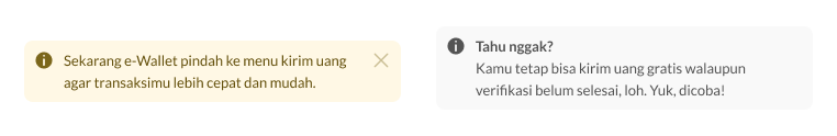
We’ve always believed even small things can create inconsistency in our design. That’s why we discussed how we wanted to move forward, set some rules, and changed the design to have a more clear usage for us and a more consistent experience for our users.

2. Categorized and structured the components
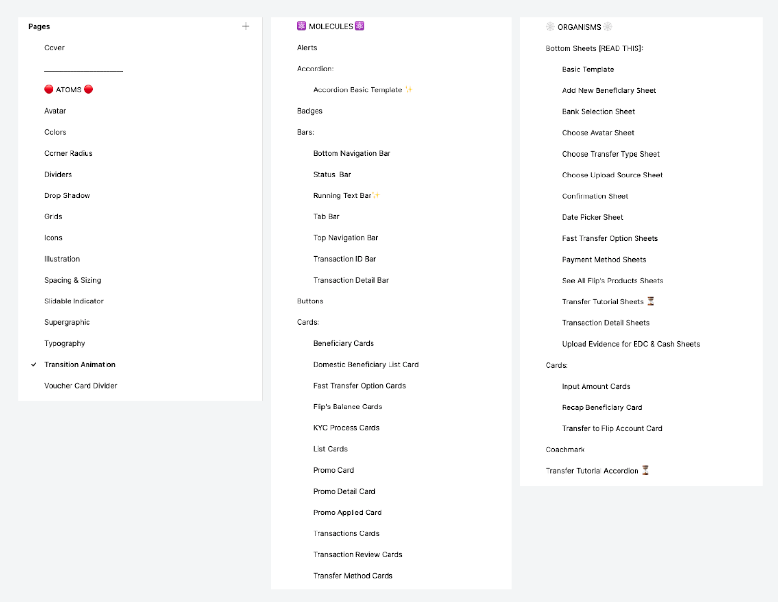
We chose Atomic Design as our method. Atomic Design is a design system with complex components made out of smaller components principle. There are five elements in Atomic Design: Atoms, Molecules, Organisms, Templates, and Pages.
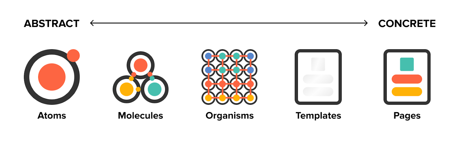
This method promotes consistency and cohesion across the entire experience and serves as a friendly foundation for teams to modify, extend, and improve on over time. Moreover, it allows us to shift between abstract and concrete elements quickly. We can simultaneously see our interfaces broken down to their atomic elements and how those elements combined to form the final experiences.
In practice, constructing the components using atomic design (and using the right tool that can support it such as Figma—its components and variants feature are amazing!) boosted up or UI design crafting process.
To do that, first we needed to make a list of components for each element. This is a small example of our components.
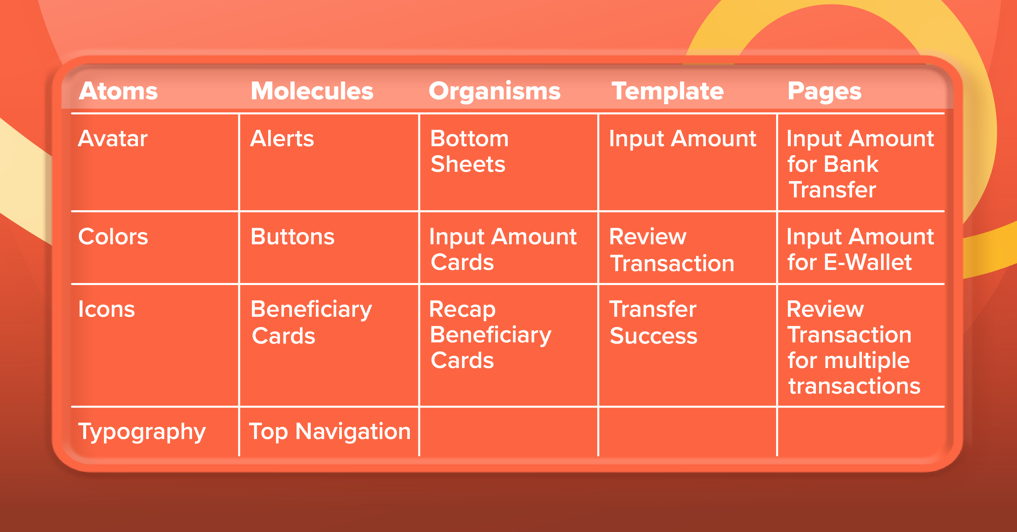
Through this component categorization, we could discover where to start—which components to build first so we could support and form bigger components. However, building a design system is not a linear process.
It’s completely okay not to figure out all the atomic elements in the beginning. We can add new components as we go or as new needs come up. What’s important is to know how we should construct that component based on this atomic design method.
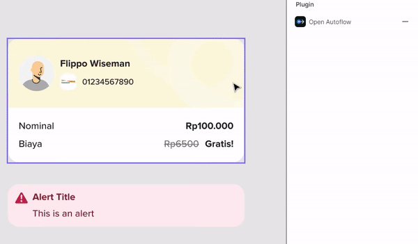
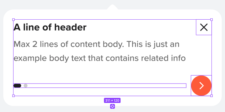
Here is the illustration of how the atomic elements are combined to form a complete page.

3. Started crafting
Once the list of components was ready, we proceeded to craft the components, starting from Atoms since it served as the foundation to comprise all our interfaces. Atoms can be:
- Basic components that can’t be broken down any further without ceasing to be functional, e.g. avatar, icons, dividers, supergraphic, etc.
- Base styles to establish a shared guideline, e.g. colors, typography, drop shadows, grids, etc.
In our adoption, Atoms are not limited to components; we use them all across the app, like layout grids, page transitions, etc. The goal is to make our design and behavior consistent as well.
We wanted our design system file neat and easy to access for every stakeholder. Thankfully, Figma has a cool feature: unlimited pages in a file, so we used it to make an index of a folder for each component. We ordered it alphabetically in every type of atomic structure (atoms, molecules, so on).
We assured all components were connected and nested well. We didn’t create new components until the smaller elements in every component had been stated.
4. Discussed and aligned together with all related designers and engineers
Once we had a draft with enough content to be discussed, we pulled our designers and engineers for a walkthrough of the design system. This process ensured minimum friction down the road, as both designers and engineers would be the main users of the system.
As a result, we created clear communication channels and cadences to ensure there was a clear alignment amongst various stakeholders as we proceeded.
5. Launched, learned, iterated
After covering the basic components and styles for our products, we published the Design System & UI Kit Library and started taking notes of its implementation to understand what to improve in our next iteration.
The launch was just the first step. For our design system to be relevant in the long term, it was essential for us to constantly review and update it over time to ascertain its relevance. We held regular meetings with designers to review all components to confirm that everything was updated.
The biggest learning from this process was that creating the design system was not only challenging, but most importantly, it was fun.
Epilogue: Learnings
The process of building the design system wasn't smooth sailing. However, this was something we anticipated from the start. We also had expected some unidentified challenges to come up midway as follows:
- As we didn’t use the atomic design structure from the beginning, midway through the initiative, we needed to break down all components to the smallest atoms, made sure they were all connected, and rebuilt them using the new structure. This included removing useless layers, adding auto layout, fixing the responsiveness, etc.
- Confirming all use cases were identified and facilitated in the design system required extensive communication with all the contributors. Finding a common spec for each component to assure all components would be reusable for current and future use-cases.
- Component naming became another challenge for us. We had to ensure all stakeholders were aligned with the component names to comply good usability.
- We made sure all existing components were proportional to the page it belonged to.
- Timing was vital, as we built this design system in parallel with ongoing projects.
On the brighter side, here are some positive outcomes from this initiative:
- More consistent design across products offers a consistent experience to users.
- Using available components speeds up turnaround time in design conceptualization.
- Engineering team can implement the design faster.
- Having the design system as SSOT (single Source of Truth) makes it easier to check the accuracy of implementation.
- Design system becomes the common language for all stakeholders.
That’s it, folks!
Hopefully, this will help you in creating your own Design System. Should you have any interest to be part of us, check out our openings and join our organization!


