Working as a Product Designer at Flip since 2020, I’ve encountered numerous design challenges, but one of the most memorable was the complex task of managing translations for both English and Bahasa Indonesia. Our goal was to create content that felt natural and localized to each audience, so relying on standard translation tools or AI wasn’t an option. We needed localized translations that accurately captured the tone, style, and context of our app, and that meant working closely with our UX writers, who would craft custom translations for every screen in our designs.
The Initial Approach: Duplicating Designs

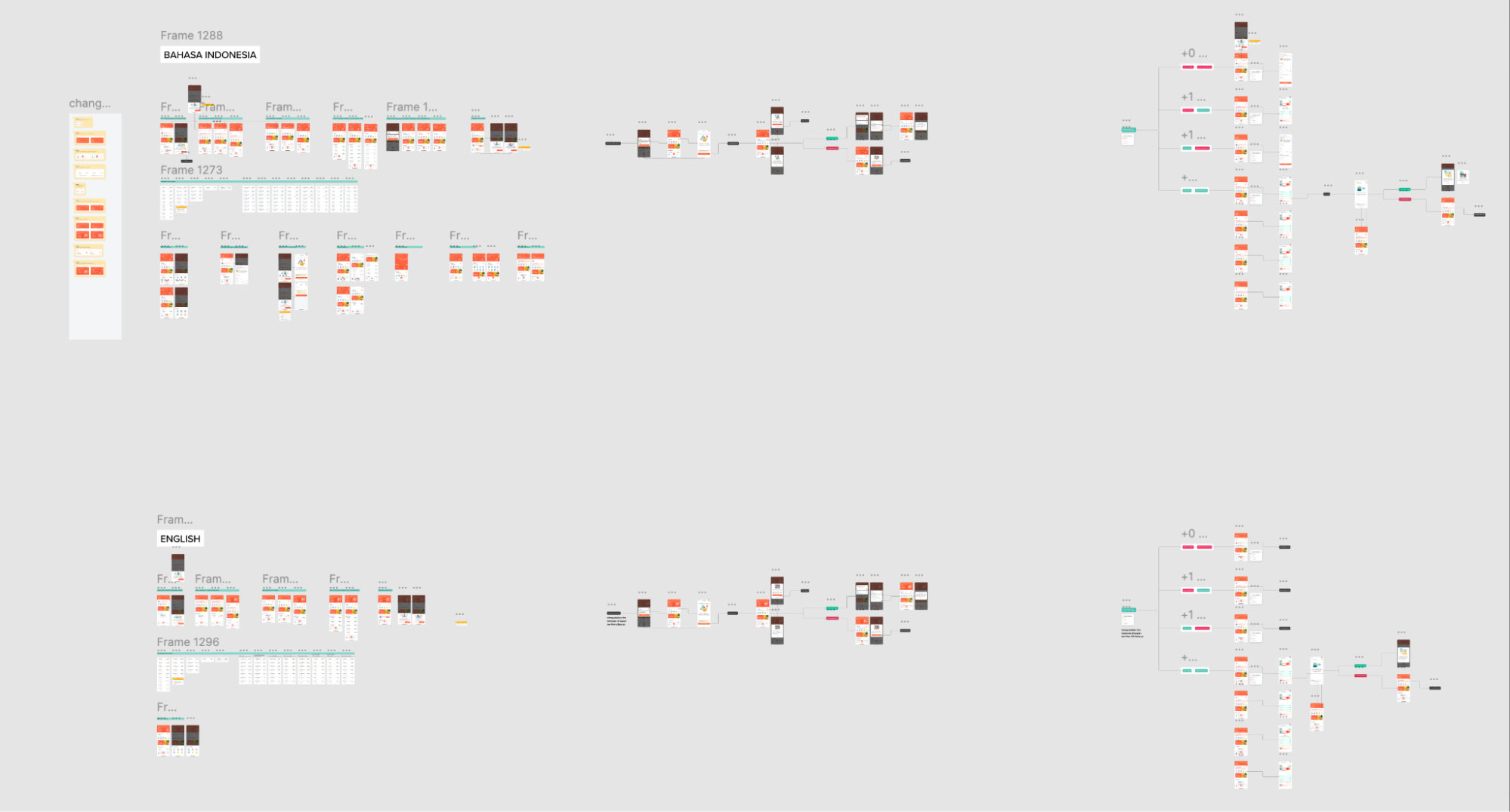
At the beginning, our approach seemed straightforward. We thought the simplest solution would be to duplicate each design—one version in English and another in Bahasa Indonesia. This method worked well when designing only a few screens. We’d design the Bahasa Indonesia version first, then create a copy for English, ensuring that all the text was translated by our UX writers.
However, as our product grew and more features were added, the number of screens multiplied, and maintaining two separate design versions became increasingly difficult. Each time we updated a piece of copy, we had to remember to replicate the same change in both versions. This manual process was tedious, error-prone, and not efficient. It required designers to keep track of every small tweak, and the slightest oversight could lead to discrepancies between the two versions. Engineers also struggled because they had to cross-reference between the two designs to ensure everything matched, leading to more errors in the development process.
Lost in Translation: The Figma Comments Experiment
Recognizing that our initial approach wasn’t sustainable in the long run, we tried using Figma’s comment feature. UX writers would leave translations as comments directly on the design, marking where each English phrase needed to be translated into Bahasa Indonesia. This allowed us to avoid duplicating designs, but it quickly became apparent that this method had its own set of challenges.
As the number of comments grew, it became increasingly difficult to manage. Conversations would often spring up around a single comment, resulting in long, tangled threads that were hard to follow. When someone needed to revise a piece of copy, finding the final, approved version became a frustrating scavenger hunt through dozens of comments and replies.
Another challenge was that it was difficult to track which translations were still under review and which ones were finalized. Overall, this solution made our workflow even messier, and it didn’t provide the clarity we were hoping for. Final verdict: this approach didn’t work 👎🏻
The Brainstorm Session: Searching for a Better Solution
When our previous approach fell short, we didn’t stop there. Instead, we regrouped to rethink our strategy. The challenge was clear: streamline the translation process without juggling multiple design files or drowning in endless comment threads.
To find a solution, our design team held a brainstorming session. We explored various localization tools and plugins, including some tailored for Figma. Yet, many were either overly complex or beyond our budget. We needed something that simplified the process, not added layers of complication.
After much discussion, inspiration struck. “What if we could annotate translations directly in Figma using a single component?” I proposed. The idea was to create a component that flagged text for translation and allowed UX writers to add translations directly within the design, with no duplication needed. The concept drew from how UX writers often include alternative copy notes and we repurposed here for translations with real-time status tracking.
The team was intrigued. We decided to test this idea, excited by its potential to simplify and improve collaboration.
Experimenting the Translation Annotation Component
From this idea, we developed a custom Figma component that we eventually called the “Annotation” component. The concept was straightforward but powerful: instead of duplicating entire designs for different languages, the Annotation component would allow us to mark which text needed translation and display the translation right alongside it. This way, engineers could see both the English and Bahasa Indonesia text within a single design file, simplifying the implementation process.
To further streamline the workflow, we added a status system to the Annotation component to track the progress of translations. The status options included:
- Draft – For initial versions of the copy that were placeholders and still needed refinement.
- On Review – When the copy was being fine-tuned or reviewed by UX writers, translators, or other stakeholders.
- Done – When the translation was final and ready for engineers to implement.
- Deprecated – For copy that was no longer in use or needed to be removed from the design.
This status system became an essential feature, especially for engineers and stakeholders who needed a quick overview of the translation process. Now, instead of guessing which translations were finalized and which were still being edited, they could easily see the status of every piece of copy at a glance. This reduced the need for constant back-and-forth communication and helped keep everyone aligned.
Testing and Refining the Solution
We began by testing the Annotation component on a few small projects, and the efficiency gains were immediately apparent. There was no longer a need to maintain two separate design versions. Instead, engineers could view both language translations within a single design, and they could see exactly which copy was finalized and ready to implement. If a piece of text was still under review, the status would clearly indicate that it wasn’t yet ready, preventing confusion and mistakes.
The Annotation component also made it easier to track progress. Designers, UX writers, engineers, and stakeholders could all refer to the same design file, which meant there was no need to rely on separate communication channels to get updates. The status system provided a transparent way to monitor which translations were completed, which were in review, and which still needed work.
Overcoming Challenges
Of course, the Annotation component wasn’t perfect. One of the initial challenges we faced was getting everyone accustomed to the new system. Designers and UX writers had to learn how to use the component effectively, and there was a bit of a learning curve as we worked out the best practices. We also had to ensure that the status system was consistently updated; otherwise, the benefits of the system would be lost. We addressed this by holding regular syncs to review the progress of translations and ensure that everyone was using the component correctly.
However, for our typical design needs, the Annotation component provided a straightforward and efficient solution that addressed most of our pain points.
Two Years Later: Still a Core Part of Our Workflow
Now, in 2024, two years after its creation, the Annotation component remains a core part of our design process. While it isn’t without its limitations, it’s fast, cost-effective, and reliable. The best part is that it has kept our workflow lean and focused, saving us time, reducing errors, and ensuring that the entire team remains on the same page—literally and figuratively 💅.
The success of the Annotation component has shown us the value of developing custom solutions tailored to our specific needs, rather than relying on off-the-shelf tools that might not fit our workflow. It’s allowed us to manage translations efficiently, without duplicating designs or creating unnecessary complexity.
Final Thoughts: Lessons Learned
This experience taught us that the most effective solutions don’t always require expensive tools or complex systems. Often, they come from a deep understanding of the specific problem and close collaboration within the team to design a solution that fits seamlessly into the workflow. In our case, the Annotation component allowed us to streamline translation management with minimal overhead and clear communication across departments.
By adding a simple yet powerful status system, we further improved efficiency, ensuring that everyone involved knew the progress of the copy at any given stage. It’s a testament to how small innovations can have a big impact, and how a collaborative, creative approach can lead to practical, lasting solutions. This project reinforced the importance of listening to feedback, iterating on ideas, and finding ways to simplify processes rather than complicate them
—
Hope you enjoyed the lessons learned and solution as well it will inspire you to craft your unique style.
We're a group of passionate individuals who thrive on collaboration and pushing boundaries.


