
Behind-the-Scenes Progress: Build and Evolve Our Styles, Guidelines Documentation, and Develop Illustration System
In 2020, Flip decided it was time to launch its ownable and unique illustration style. They needed to refresh and realign the brand positioning since the financial sector is typically seen as serious and monotonous.
Unlike other financial brands, Flip aimed to position itself as warm, approachable, and close to its audience and users. To achieve this goal, flip wanted to incorporate their unique illustration style within their app.
Back Story of Illustration v1.0
In the initial stages, we started to define our identity. Based on the brand's fun and casual tone, we tried many explorations to convey the intended vibrancy. Then, it all boils down to our internal company voting on what they think is the best representation.
We started with a huge gap difference between each alternative before we jumped to more similar options. At this stage, the internal design team decided which technique we wanted to use (see inside the green box in the picture below). We used the crayon technique to add uniqueness to the visual and build up the mood of a casual presence.


Adapting to these preferences, Flip Illustration Style v1.0 made its first release towards the end of the year. It was not a huge haul, instead, we released all assets one by one flow and completed all checkmarks in the first quarter of 2021.
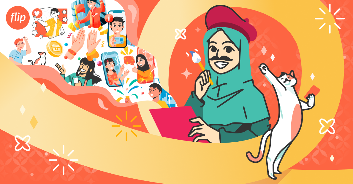
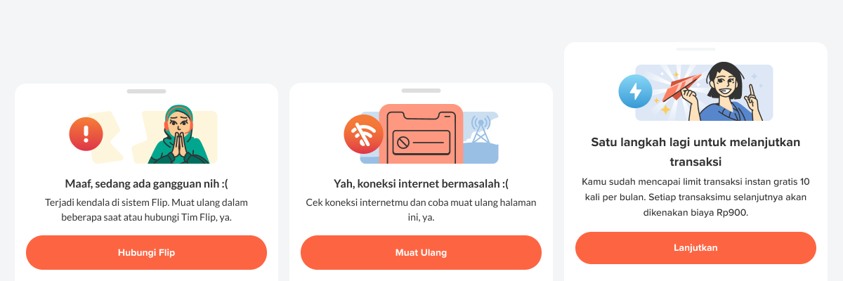
The Illustration Style v1.0 communicated Flip's friendly presence with bright colors, personal closeness through unique brush details, and intentionally designed characters that resonated with Flip's youthful vibe, addressing users as "Kak" (a friendly term in Indonesian, akin to "bro" or "sis") to foster familiarity with the audience.
Orange and Yellow are (both) the main colors. The shaped base is a flat vector that blends with masking brushes to add depth and dimension to the shape. The casting of light and shadow shaped from crayon effect brushes. All direction is to extract a whimsy and excited mood for every screen appearance.
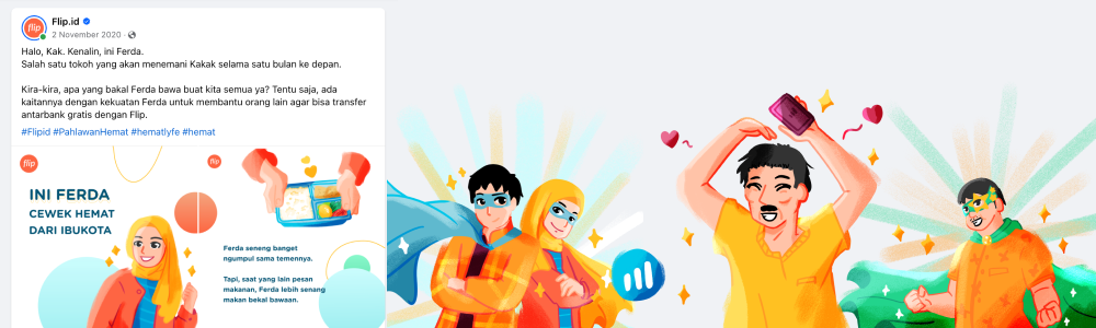
Subsequently, illustrations in the same style gradually appeared in social media campaigns.
Along the way, we reflect on how we can improve our character. First released we were using the reddish skin tone, after many iterations later we introduced new skin tones to support the diversity of Flip's audience from Sabang to Merauke.

Build-Up Story
Reflecting on the journey, after a full year of greeting Flip app users, we re-evaluated the outcomes of the Illustration Style v1.0 previous year's exploration.
During this period, Flip continued to evolve and recognized shifts in our brand voice. We moved away from using "Kak" as it could be inappropriate in some financial situations, despite our efforts to keep it light-hearted.
Another significant change was the homepage and UI redesign within the Flip app, prompting us to upgrade the existing illustration style. We decided to transition the illustrations to a more mature and dependable persona, especially in financial transactions.
Through our introspection process, we identified several points for development, including:
- Warm and bright colors sometimes overwhelm the contrast of primary buttons on app pages.
- Character designs are intended to be friendly and playful, as we were aware of this resemblance in common children's book illustrations that might be concerned with the trustworthiness value of our presence.
- Polished details complicated the potential for illustration assets to evolve technically for animation and print needs.
- Excessive attributes that impacted the quality and file size of exported assets within the application.
Overall, these insights became the starting point for Product Designers to collaborate with the Creative Team in refining and developing the next iteration of the illustration style.
Weakness and Opportunity
We found that the former illustration style (v1.0) needed more depth and contrast in conveying its message. So, we conducted a brainstorming session to collect inspirations that resonated with Flip's presence: fairness, friendliness, and smartness. We compiled several mood boards for evaluation. We worked with existing briefs, exploring different options to gather feedback.
We reflected on what we liked and disliked, learning much from references, from left to right, such as Hergé (Tintin), Noritake, Okamura Yuta, and Adrianne Walujo. What their artwork styles all have in common is the way they tell the narrative, which is neat, thoughtful, and inspiring.

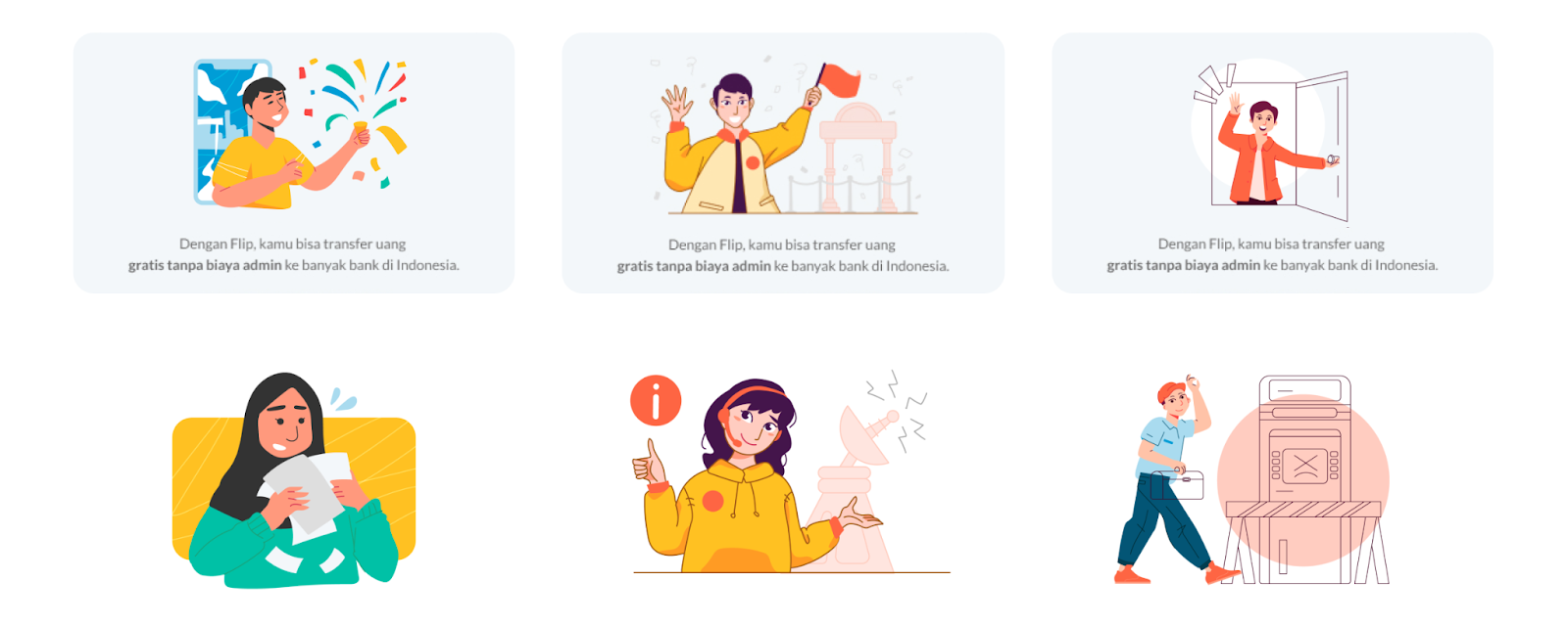
Extracted from all references, our main direction is influenced by key features from the Clear Line style (French: Ligne Claire) which have the characteristics of clarity of contours, scarcely any shadows, and monochromatic coloring of larger surfaces. The features suited Flip's aim to present itself as straightforward, trustworthy, and reliable.
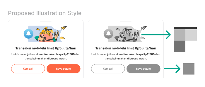
After several rounds of exploration and feedback, we began experimenting with three options for the proposed illustration style by previewing them on our draft landing page. Comparing the preview of the previous illustration style with proposed alternatives can help us to feel and see the overall ideas first before we consider the technical side.


The pro’s consideration of the new illustration style:
- The line is a distinctive boundary between colors and contrast is well defined.
- The lack of shading and bold, blocked colors achieved a vibrant look without bright colors.
- Simple color means the distribution is set to use less orange to avoid overpowering the call-to-action Flip button on the screen.
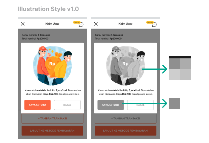
- Realistic proportions in character design appeared more believable and calm, an expression of a gimmick or exaggeration is less needed.
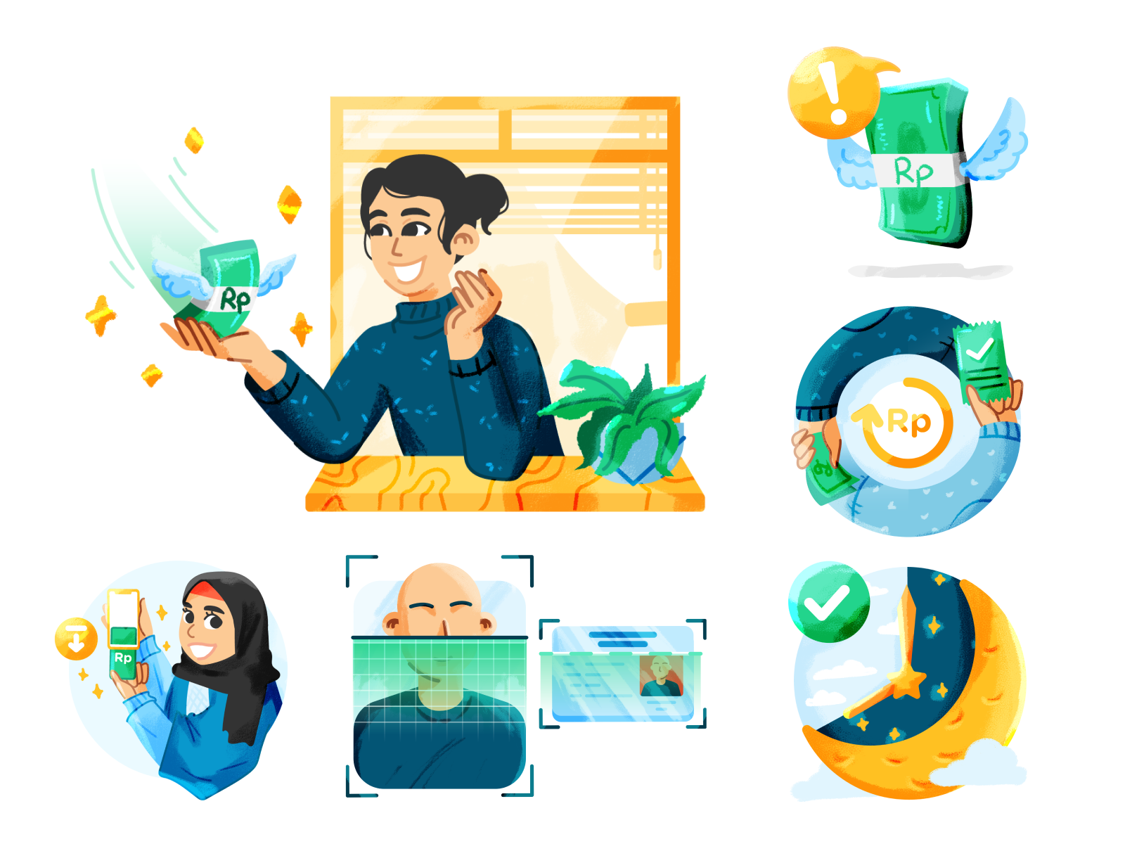
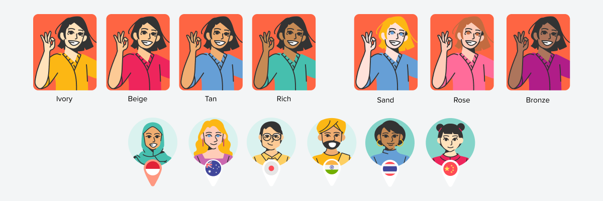
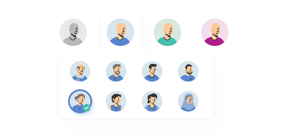
- Arranging facial characteristics and skin colors according to the local community was needed to establish a personal connection with the audience. For international cases, characters were created diverse to fit the destination country.
- Uncomplicated details and perspectives lightened users’ cognitive load. Combined, they visualized and narrated neat linework.
- Illustrations became easier to animate.
Get Gather Together
How do we know the new illustration style will solve the pain points? It’s a long journey and back-and-forth iterations. We set up workshops between illustrators, creative designers, graphic designers, and product designers to align the art direction we wanted for future assets. We discussed the strengths and opportunities of the proposed new style, and alternative options, reviewed a few cases, and then evaluated them at the end.
We used this set of goals in each step to gather insights and understand the process.

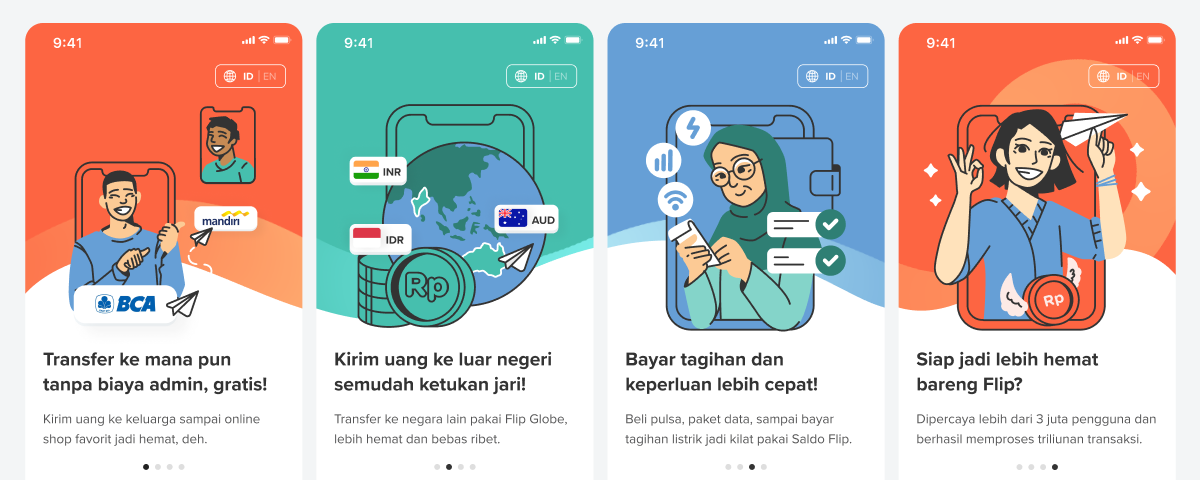
First, we established a foundation in color, lines, and characters for the new illustration style, testing it on the onboarding and some spots that required metaphorical communication.
After completing the necessary details, we built the "Hand Drawn Flat Style" documentation guidelines to align the visuals among fellow designers and illustrators in the future. The guidelines include:
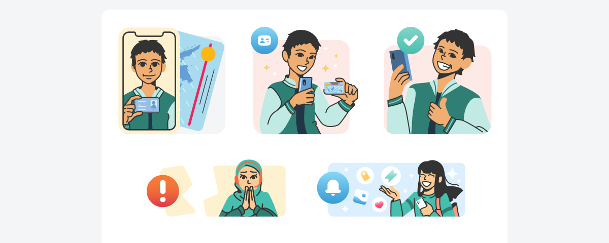
- Foreground: Character-driven focus with necessary details like facial expressions, skin color, and body shape to express and simplify ideas.
- Background: World-building to support the main characters.
- Do’s & Don’ts: Tips for line treatments, ensuring the foreground pops against the background, and setting up scenes.

Implementing the New Illustration Style
The process of developing and exploring the new illustration style took us 3 months, and we launched it in the app at the beginning of 2022.
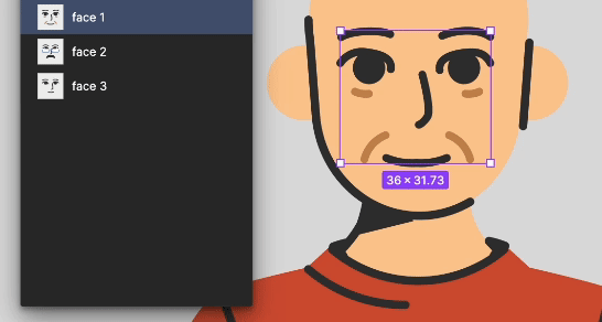
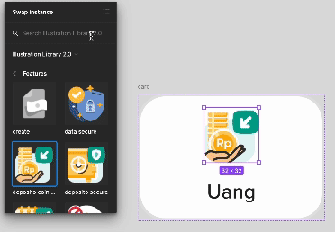
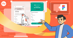
The cool thing about this new illustration style is its modularity; being fully vector-based makes it super easy to mix and match elements and save everything as components in our asset library.
The impact of this change cut down the time for crafting illustrations from 1-2 days per project to less than 6 hours.

Requests and searches for assets are now more organized and structured. Designers can request illustrations by filling out a form and then accessing the files directly from the component library.

Revising assets is a breeze—just change the master component and it updates all child components in the designers’ files.

With more varied needs, keyword searches make it easy to find what you need. Designers can create wireframes faster with visuals that are already halfway there.
Revising content is quicker because assets are treated as component variants.
Users will encounter the same character in similar cases. Designers can search using the character's property.
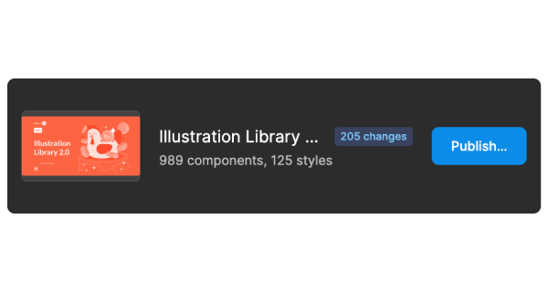
In parallel, we update the former illustration assets with the new one, Illustration Styles v2.0 one by one as per request. As time goes on and on, we have been developing the assets library including more than 500 components from its release in 2021 (eta 30+ months!).
Last, but not least Iterations
After updating our old illustration style to the new one, the process didn’t stop there. This style was crafted collaboratively with in-house illustrators and designers at Flip, allowing for continuous feedback and evaluation. Regularly, we explore our current style redraw from other styles, as we want to evaluate and compare, keeping up with evolving illustration trends.
Guidlines & Documentation
Unlike the surface-level documentation in the 2021 brand guidelines, 18 months later, we released the 2023 Illustration Guidelines, which are much more comprehensive, covering topics like:
- Illustration principles: Considerate, Confident, Consistent.
- Elements: construction, color, lines, space, foreground, background.
- Deeper character design: anatomy, perspective, graphic elements, and decoration.
- Differences between assets: icons vs spots vs scenes, divided into 4 categories—Operative, Informative, Descriptive, and Narrative.
- Best Practices with do’s and don’ts and case studies.
- Technical issues like file formats, artboard sizes, exporting, and even giving structured feedback.

This documentation is essential for other illustrators and designers to get coherent and comprehensive details about the illustrations.
What’s Next?
Our journey of creating and evolving the V2 illustration style comes with several lessons:
- Nothing is absolute: Proactively seeking new knowledge and continuous feedback helps connect our thoughts. The world is always changing, this project is, and always will be, an ongoing process for improvement.
- Priority: Discussing and aligning milestones can help us to differentiate between what’s the first-things-first and nice-to-have initiatives.
- Collaboration: Having a collaborative spirit is important, but equally important is speaking the same language as a foundation to understand the bigger picture and intentions.
When we actively look for new experiences and take the time to think about them, we learn new things and make more connections in our minds.
"You can't connect the dots looking forward; you can only connect them looking backward. So you have to trust that the dots will somehow connect in your future." ― Steve Jobs
We value the work we do, and we couldn’t have done this without the help of many Product and Creative team members.
Big thanks and credit go to these amazing people:
Wildan, and Arham from the Creative team for helping out with collaboration to complete the first phase, their ideas making all of this possible.
Aziz, Ed, and Shaflian from the Product Design team for their constant encouragement and assistance with the technical aspects.
Syifa and Gea for the invaluable feedback, direction, and insight as a guardian of this project.
Once again, thanks for being such a fantastic team. Let's keep flippin’ our creative energy!
—
Hope you enjoyed the journey of Flip Illustration’s behind story as well it will inspire you to craft your unique style.
We're a group of passionate individuals who thrive on collaboration and pushing boundaries.
So, why not jump in and be part of something special? We’re hiring!


