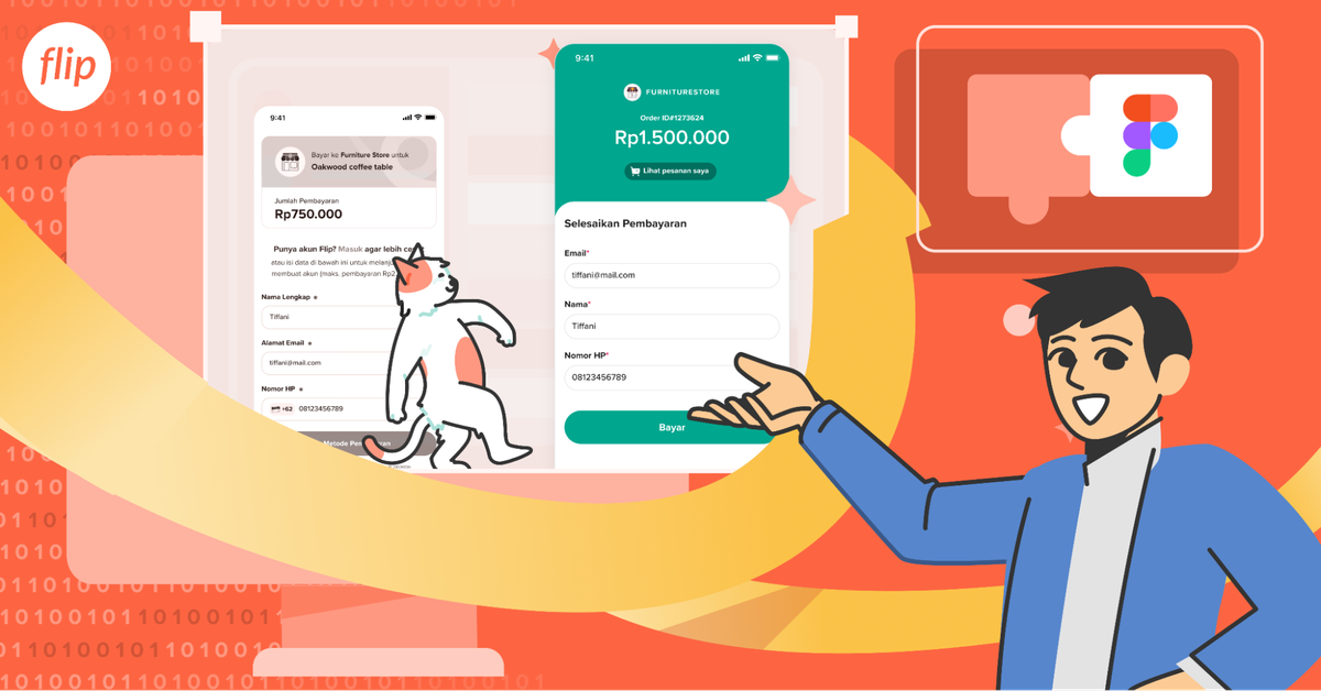
Where It All Began 👀
The need for a revamp struck me while I was scraping through old Figma files and looking for references. As I revisited the layouts, colors, and elements of previous projects, I couldn’t help but smile at the memories of long design sessions, debates, and too many cups of coffee ☕️.
As I explored further, I started noticing the flaws—buttons that were too large, forms that didn’t flow smoothly, and layouts that felt either overcrowded or oddly spacious (large enough to park a private jet 😂). It made me question, "How did I come up with this design?"
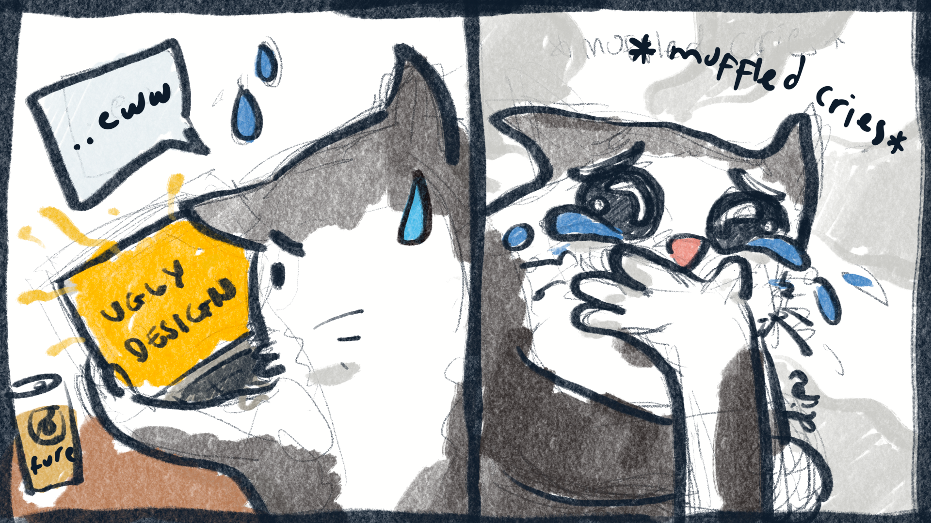
It wasn’t just my own reflection that sparked the change. User feedback highlighted areas where the experience could be better—complex flows, cluttered pages, and moments of friction. Their insights, paired with my review, made one thing clear: Accept Payment needed a refresh to meet current expectations.
Why We Revamped Accept Payment 🔄
The decision to revamp Accept Payment wasn’t random—it was driven by user feedback, a design audit, and an honest look at our competitors.
User Feedback Drove Change
Our users spoke, and we listened. They loved the core functionality of Accept Payment, but consistent feedback highlighted areas where the experience wasn’t as smooth as it could have been. Users pointed out friction such as:
And let’s be real—if there’s one thing users hate, it’s friction. So we rolled up our sleeves and got to work. Simplifying Accept Payment was priority number one. We wanted users to zip through transactions with ease. Our goal? A smoother, cleaner, and far more intuitive experience, where everything just works the way you expect it to.
Conducting Design Audit
We didn’t stop there. Alongside the valuable feedback from our users, we took a closer look at Accept Payment through a thorough design audit. Turns out, some parts of the interface had been hanging out since... well, longer than we’d like to admit. As tech advances and user behavior shifts, old design elements can start to feel like that outdated wallpaper your parents still have up. So, we took a hard look. The audit revealed a few design sins—layouts that were less “consistent” and more “all over the place", visual elements that were practically begging for an update, and usability quirks that we honestly couldn’t ignore any longer.
The result? A clear improvement plan. This wasn’t just about making things look nicer—we needed to overhaul the entire experience to ensure it was relevant and easy to use. The goal was to make Accept Payment both visually appealing and highly functional. After all, if users can’t navigate the app smoothly, then we haven’t done our job right. So, we focused on creating a cleaner, more intuitive interface that felt as seamless to use as it was to look at.
Staying Ahead in a Competitive Market
In today’s fast-paced industry, staying competitive is non-negotiable. With so many payment solutions available, standing out requires more than just solid functionality. We carried out a comprehensive competitive analysis, benchmarking Accept Payment against other leading payment products in the market. This process wasn’t just about seeing how we measured up—it was about understanding what the best in the industry were doing right. We looked at how competitors handled user flows, design consistency, and security measures, and what became clear was that the top solutions weren’t just beautiful—they were seamless, intuitive, and instilled confidence in users with every interaction.
The competitive analysis gave us key insights into where Accept Payment could improve and, more importantly, where we had the opportunity to surpass the competition. It was clear that to stay ahead, we needed to focus not just on aesthetics but also on performance and user trust. By refining the experience, adding layers of security, and streamlining the design, we aimed to make Accept Payment a standout in the market—one that users not only prefer but trust implicitly.
What Made the Revamp Exciting 🎉
Despite the challenges, the process of revamping Accept Payment was incredibly exciting. Collaborating with our UX writer and fellow product designer brought new perspectives to the table, allowing us to combine creative ideas. This revamp is not only the design but also the information and content. Each brainstorming session felt like a step closer to a solution that truly resonated with our users.
The iterative design process was another highlight. Refining concepts through feedback and exploring alternative approaches turned even setbacks into opportunities. Every tweak felt like progress, pushing us to create something better. Each step forward felt like a small victory, especially knowing how these improvements would directly benefit our users.
Seeing ideas take shape, from initial sketches to full-fledged designs, was a thrill. Every tweak and every improvement felt like progress toward creating a product that would not only meet but exceed user expectations. Even the smallest wins, such as seeing a ✅emoji response on the Slack thread about this project can put a big smile on my face 😭
And then came the best part: seeing the design come to life. After months of iteration, watching users interact with a more streamlined, intuitive Accept Payment feature was the ultimate reward. The changes we made weren’t just visual—they enhanced the entire user journey, making it smoother, faster, and more enjoyable. ✨
Final Thoughts
Revamping Accept Payment wasn’t just about making a few tweaks—it was about reimagining how we can deliver a better, smoother experience for our users. Every iteration brings us closer to creating a product that’s not only functional but also enjoyable to use. And while the work is never truly finished, that’s part of the fun. We’re always looking for ways to improve, to simplify, and to make sure every interaction feels effortless.
We’re excited about where we’ve landed with this revamp and even more excited about what’s next. If you’re as passionate about design, innovation, and creating seamless user experiences as we are, why not join us? Stay tuned for exciting job opportunities—visit our career page to see how you can be part of Flip's journey. We’d love to have you on board!

